MoCCA Fest 2024
Attended MoCCA Fest 2024, day 1! Inspiring work and wonderful artists all around. Much appreciation to the Society of Illustrators for putting on this event; it really has evolved throughout the years. Nice to be around enthusiasm for self published comics, independent artists, and publishers alike with an abundance of comics, illustration, and adjacent ephemera!
Funny to think it’s been a decade since I first tabled at MoCCA at my alma mater's table. I have great memories of attending MoCCA Fest for the first time in 2013, and then tabling the year after with my school at MoCCA Fest 2014.
My small collection of treasured zines continues to grow. Sharing a few things I got this time around. Thank you MoCCA Fest 2024!
Sylvester’s Letter with sticker sheet illustrated by Josh Cochran, Enchanted Lion table
Fall Dragon riso print by Natalie Andrewson
Of Thunder & Lightning by Kimberly Wang, Silver Sprocket table
Riso machine sticker and business card, Lucky Riso Press
(left) Bark Bark Girl by Michael Furler, (right) Rainy Summer Day by Linnea Sterte, Peow Studio table
Riso Animation How to Guide zine by Alex Barsky, Zine Hug table
Lighthouse riso print by Cecilia Ruiz
Frog and Toad print by Megan Wang
Screen printed Crow patch by unknown artist, possibly MICA Illustration table
Calendar by Fan Tang, Syracuse University VPA Illustration Table
Larry's Little Lies Picture Book
Happy to announce the second book in the series authored by Brazil Reynold-Martinez, “Larry’s Little Lies” is out now! Thank you so much to Brazil for collaborating with me again on this project. I wanted to differentiate the artwork between books, but still have them share some identity. I used colors and textures similarly between the two, but played with line weights for certain elements in the second book. Thank you to all who have bought a copy so far! Click here to purchase the book online!
Color & Light Class: Value
Very excited to share some work that I’ve made in Kat Tsai’s Color & Light Class. It’s been so informative so far. I love seeing everyone’s assignments every week and being a part of an open discussion with my classmates on discord! Here is a link to more info about the class! https://www.chuwenjie.com/class
Below are value studies of a photograph that I took of Grand Central Station (from Park Ave) on Halloween of 2019, back when I commuted into Manhattan for work. I had a good time trying to compose the same drawing in different ways according to the major and minor keys. I have not studied art using the value keys before, so this information really made an impact!
The assignment was to only use 4 values for the value study, which really helps with learning how to design and breakdown visual information into only what is necessary. This exercise really made me think, and I’m excited to put this into practice more!
Major keys are about the balance of lights and darks in a piece. High major indicates a higher proportion of light values, while low major indicates dark values.
Minor keys measure the contrast in a piece. High minor is high contrast, while low minor is low contrast.
Above is the exercise we worked on after creating our value study to practice the value keys. I will continue to put this kind of study into practice! (Remember to do your art studies!)
Wholesome Games Jam 2022
I participated in my first game jam a few weeks ago: Wholesome Games Jam 2022! Thank you to everyone who put the event together and big thanks to my team for a really great experience. Reunion is a typing game and works in browser. Check it out! Link to game on itch.io here #wholesomejam
Reunion is a game about getting back in touch, reuniting, and sharing space. Our characters are found chatting and reconnecting at a high school reunion. Things can feel awkward, shaky, and uncertain, but we can share those feelings and those moments together. Maybe all we really need is community.
Alexis is Angry Picture Book
It’s here! Alexis is Angry, my first published picture book is out! I am so proud of the process and everything that went into creating this book. I finally made the leap into picture books! So thankful to have worked with the amazing Brazil Reynolds-Martinez on this project. She has been so great to work with and I really appreciate her. This book means a lot to the both of us.
Alexis is Angry is available now. Click here to buy the book online!
A big thank you to everyone who has purchased the book and for supporting our work. Hope you enjoy it!
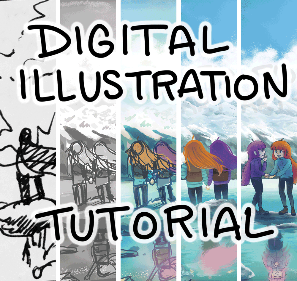
Digital Illustration Tutorial: Huaytapallana Celeste
I thought a blog post would be a nice way to share my illustration process. In this tutorial, I will be using Adobe Photoshop, but this information can be applied to any program.
I’m happy to be able to share what I know with anyone that might learn from this. Here we go!
Step 1: Analyze
Analyze the assignment. Figure out what you want to convey to the viewer. I tend to think about what sort of mood I wish to convey; something lighthearted, serious, silly, ominous etc.
Step 2: Thumbnail Sketch
Sketch a few iterations of your concepts. It’s good to have three strong thumbnails for a final illustration if it is for an assignment. Composition tends to be my priority at this step; think about how the viewer’s eyes will move through the piece. Sketch until you have sketched enough to continue to the next step. I like sketching out ideas in a physical sketchbook initially, but I also sketch directly in Photoshop.
Here are my sketchbook sketches! I had a few different moods/ concept options.
Step 3: Values
I used Adobe Photoshop for this illustration, but there are many digital art programs out there that can be used for digital illustration such as Clip Studio Paint, Krita, Procreate etc. At this point, I open my sketches in Photoshop to create value sketches. For this piece, I created my value studies digitally. It’s good to think about the values of the foreground, middle ground, and background to establish depth.
I was trying to decide between two of my sketches that communicated slightly different moods. I decided to go with the sketch on the right, but I did make changes to the figures on the final piece.
Step 4: Color Sketch
Most of the time, I have a color concept for the piece in my head at the sketch phase of the illustration, but it does evolve and change as I progress through the piece. I would recommend studying color theory and studying different artists, painters, photographers, filmmakers etc on how they use color to direct the viewer. Using colors that make other colors pop or recede is important to think about so that they can be used as compositional guides as well.
I lay out the rough color sketch I had in my head. The piece can change the more I work on it, but most of the time I'd say the color sketch is what the final will roughly end up looking like.
Step 5: Painting the Background
For this illustration, I wanted to create a painted/ more impressionistic background. I really enjoy painting, and I try to paint the way I would traditionally. The main difference is that for digital art, I separate different elements of the background into their own layers so that the piece is easier to edit if I need to make changes to a specific section of the piece. I like to lay down flat colors (ex. the mountains) and then build the paintings up by using several layer masks.
When I start to render details (ex. the water) I keep the types of textures I want to use in mind. Painting and rendering is the part of the piece that can easily get me in the flow state. I render and render until I feel like the background is nearly done.
Here is what this piece looked like during the painting process.
Here are more detailed sections with added textures.
Step 6: Figures
So for this piece, I kept changing how I wanted to pose the figures as well as how I wanted to render the figures.
Originally, I had them posed how I had them in the sketch and they were painted in a similar way to the background, without lines. Here is what the piece looked like before I took a long break with it. I went on vacation in June, worked on a lot of other work in July, and finally came back to this piece to figure out what I wanted the figures to look like in August. Once I decided on how I wanted the finished figures to look like, the rest of the process went by pretty quickly.
I quickly sketched the updated figures. I decided I wanted the figures to look stylistically different from the way the background was painted. I wanted to show expression and emotion as well as add line art, so that's what I did. I'm glad that I made the changes that I did with this piece. Sometimes taking a break from a piece is the best thing for the piece!
Here are the steps I take when working on the figures.
It's a similar process to how I paint backgrounds, but in this case I wanted the figures to be in a 2D style.
After finishing the figures and establishing where I wanted the reflection to be, I went back to painting background elements to finish the rocks in the foreground, the water, and ripple effects on the reflection of the piece.
Step 7: Glazes and finishing touches
This is usually my last step. I play around color glazes and with layer blend modes (overlay, soft light, hard light) and layer adjustments (hue/ saturation, brightness/ contrast) until I think the piece has enough punch to it. In this case I airbrushed saturated blue and dark blue hues onto certain areas and applied the layer blend mode linear light at 65%.
Step 8: Congratulate yourself!
This step is a step I tend to easily overlook, but it's probably one of the more important steps. It's good to celebrate what you have achieved. Your piece may have turned into something very different than you had imagined, but it's good to acknowledge the work that you put in and that you stuck with it and kept at it. I'm slowly getting better at celebrating my wins. It's a process!
So there is! My quick guide on how I create my digital illustration pieces in Photoshop. I hope this was helpful! Thanks very much for getting to the end of this post if you did!
Until next time!
Kat Flores
End of the Year Thoughts- 2020
2020 was certainly not what I was expecting, but it made me think about the ways in which we respond to things we may not have anticipated.
I recognize that it is important to implement a plan that helps us find stability in unstable situations.
I had a great conversation over the phone with a really good friend of mine the other day that really made me think; yes there are things that I can do/ plan ahead of time to make myself feel safe (even though I don’t feel that is true during a moment of anxiety and panic.) I just need to communicate that to other people. This of course will require practice, as I struggle with communicating to other people:
1. That I have needs and
2. That I would like help with them to be met.
I think we can reach a better understanding of one another if we do normalize this communication and exchange of needs and aid. It is important to note that it is also just as necessary to be able to communicate when I can’t provide what someone is asking for as well. It’s a balance.
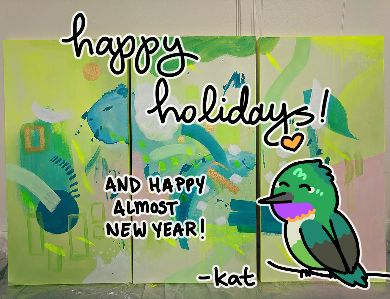
Pictured above is a painting that I made as a gift for my sister! It’s titled Inti Kallpa (Solar Energy in English.) Read a bit more about the process here. I’m hoping to create more mindful abstract art like this in the near future!
Website Updates- clean up!
Made my website updates live today! Trying to get this SEO stuff working correctly. I still have some edits to do, as you can see via the notes on the above image of my little note pad list.
I’m thinking of making this hummingbird friend my blog mascot! It’s an Amethyst-throated Sunangel (a hummingbird found in Perú.)
My wrist is starting to hurt from all of this mouse work. Hoping to sew a wrist pad with left over fabric I have in my little remnants box!
Being an artist means everything can be reused hehe. Supplies take up a lot of room in my apt!
Hopefully I can take a walk to admire the fall leaves this weekend... I'll be cleaning up the apt for the rest of the day!
Asexual Awareness Week 2017!
I like to write a bit about asexuality every ace awareness week, so here are a few words for this year's Asexual Awareness Week (Oct 22nd to 28th 2017):
BLOG ARCHIVE